How Website Design Impacts User Engagement & Increases Conversions
How Website Design Impacts User Engagement & Increases Conversions
It goes without saying that website design is a huge part of your user interactions. Simply put, the better-looking a website generally is, the higher the brand perception.
Website design is vital because it plants a positive outlook about your brand in a user's head even before they've interacted with you.
On the other hand, poor design can immediately drive them away, regardless of how well your services are priced or the quality you offer. Here are web design pointers our team has collected over the years.
12 Ways Web Design Enhances User Engagement and Conversions
1. Plan an Intuitive Website Layout
The first step is about putting the right type of plan in motion. The key here is not to go overboard with website design. The old adage 'less is more' never fit so perfectly! The website should have a proper structure that can keep visitors engaged longer.
Reduce visual clutter by assigning enough whitespace between page elements.
The area above the fold, where the users first see your website, is prime real estate. Use this space for important information about your services, including headlines, CTAs, or even testimonials. Make sure the content is planned in a way that reduces user fatigue by letting them scan through easily.
2. Speed up Website Loading
Loading speed is perhaps one of the most perceptible improvements you can make to your website.
It also plays a massive role when it comes to SEO ranking improvements, so if you have a slow-loading website, now's the time to get on it! The best place to start with speed optimization is visuals - images and video.
Ensure that all of these visual assets are compressed without hurting image quality too much. If you have heavy scripts or plugins, check if you can minify them or even replace them with other lighter plugins. Browser caching is a great way to improve speed for repeat visitors.
Opting for a CDN can dramatically improve website loading times for users, regardless of where they are.
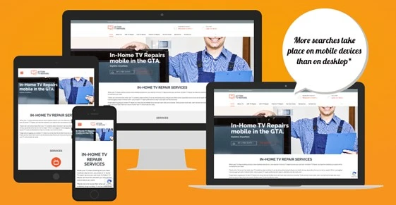
3. Ensure Responsive Website Design
Like loading speed, mobile-friendliness is another quality-of-life improvement that also has a huge impact on your search rankings.
The best way to do this is to opt for a responsive design methodology, which dynamically changes your website content to fit different screen sizes. Building a website that is responsive can help you cater to a range of different devices, improving your coverage.
Opt for the most popular screen sizes to ensure flexibility and give your users more options. Audit the typography and images to ensure they've scaled properly to smaller screens. Getting rid of some content-heavy parts of the website for mobile is also a good idea.
4. Implement Clear and Simple Navigation
Navigation is a key part of the entire UI/UX ecosystem, and it can make or break your website. The best part is that getting a simple and clean UI is a lot easier than people think.
Remember to keep menu options to a minimum so you don't overwhelm users with information. Opting for submenus is a good idea to expand functionality, but keep them limited, as people don't like to see a screen full of them.
Breadcrumb navigation has been around for a long time, and we encourage web designers, both new and experienced, to use it. It has proven itself, so you don't need to reinvent the wheel! Have a full-fledged search box at the top, and it should be available throughout your website.
5. Use CTAs Sparingly and Strategically
CTAs are powerful tools when it comes to guiding users through your website. It can also help 'push' users in a specific direction that might be beneficial for you as a brand, like downloading a case study or setting up a meeting. It is vital that you highlight these CTAs clearly through both typography and color.
The placement of the CTA button is important - ensure that buttons or links are added when the user naturally pauses.
Also consider repeating important CTAs like 'Call Us' or 'Set Up A Meeting' throughout the page. Testing CTA placements exhaustively to find the most apt position is the way to move forward.
6. Maintain Visual Hierarchy
Establishing a proper visual hierarchy is important when you design a website. It should flow from the top to the bottom with important headlines first and heavier content downwards. This also gives readers a logical order for reading, ensuring they go through the content rather than skipping it.
Ensure there is adequate whitespace throughout the page so users can differentiate between one section and the next.
The reason why visual hierarchy is vital is that it helps brands direct the user's eye through important sections of the page. It happens without them even consciously knowing it, which makes it even more powerful! Establishing a visual hierarchy also lets you prioritize important sections throughout the page.
7. Build Trust Through Professional Design
An often-unspoken effect of a professional-looking website is that people tend to trust it more than badly designed websites.
A clean and modern layout can elevate brands and help get more traffic to the website. Avoid outdated website designs and visually dense layouts that overwhelm users and stifle the natural flow.
Take the utmost care to reduce the number of 'salesy' design elements like splashing huge discount numbers or unverified claims.
Rather, opt to share verified content like case studies and testimonials at the top, without it being too 'loud'. Create a brand color palette and stick to it throughout the website - it gives the website a cohesive look.
8. Choose the Right Typography
Text exists on a website to convey information, nothing more and nothing less. But typography is a critical part of the process because choosing the wrong font and size can make content unreadable.
Choose fonts that are commonly used and are web-safe. Ensure that fonts are consistent throughout the website without flip-flopping between multiple fonts.
The font chosen for the headings should be clear and leave no room for misinterpretation. Avoid fancy-looking fonts that might be tough for people to read. Ensure there is enough whitespace between the lines, taking into consideration the font's natural spacing requirements.
9. Opt for Only High-Quality Imagery
Images and videos are a key part of the web design process and give websites an aura of professionalism when done right. Ensure that the chosen images are the highest quality possible, even after compression.
Opting for stock images or footage is not optimal when you want your clients to sit up and take notice.
Don't add too many images to a page; use them sparingly and only as needed. Not only does it slow down loading times, but it also makes the page too 'hectic' for users, leading them to click away. Using non-intrusive visual elements like motifs and lines to separate sections is a good idea.
10. Simplify User Forms and Touchpoints
If there were 5 takeaways that we would like you to follow from this article, this point would be one of them. Reduce the number of forms users have to fill out on your website. They are the most common points of friction, and they should be substituted with other methods.
If you need to have forms, ensure they can be filled out in under a minute and are clearly labeled. Autofill can take away a lot of the stress of filling forms, so ensure that it is enabled on your website. Take care to highlight required fields - otherwise, the users won't know why their forms will not submit.
11. Consolidate Brand Identity Through Design
Brand identity is a vital commodity in the modern marketplace, which has thousands of brands. When users are able to tell your business from other competing brands in your industry, it means that you now have an identity!
Brands need to focus on extending their brand identity to their website by using the same colors and themes.
Having consistent colors and design motifs throughout your website is critical for your brand identity. Ensure that your brand logo appears on all pages and align your visuals with your brand messaging. The content tone and style should be uniform across your website.
12. Leverage Data-Driven Outcomes
Rather than relying on 'seat of the pants', opt for a more data-driven approach. Analyze user behavior with the help of powerful analytics tools available today. Google Analytics is free and powerful enough to start your optimization journey with.
You can also get more insights with heatmaps that show where users' focus is on your page and how to improve it. There are other tools like HotJar and Crazy Egg that can help you with user behavior analysis through heatmaps. Adjust and optimize your webpage continuously to further improve it.
Key Takeaways
● Plan a clean and intuitive website layout that looks good and fulfils all your business requirements.
● Improve website loading speed to reduce bounce rates and get better user engagement.
● Implement a responsive design to make your website more viable for mobile users.
● Simplify navigation for users so they can find the information they want quickly.
● Use clear and distinct CTAs that can guide users and direct them to meaningful action.